Mamma Mia’s Restaurants
Fresh brand identity and website for an American-Italian restaurant group serving Massachusetts residents for almost 50 years.
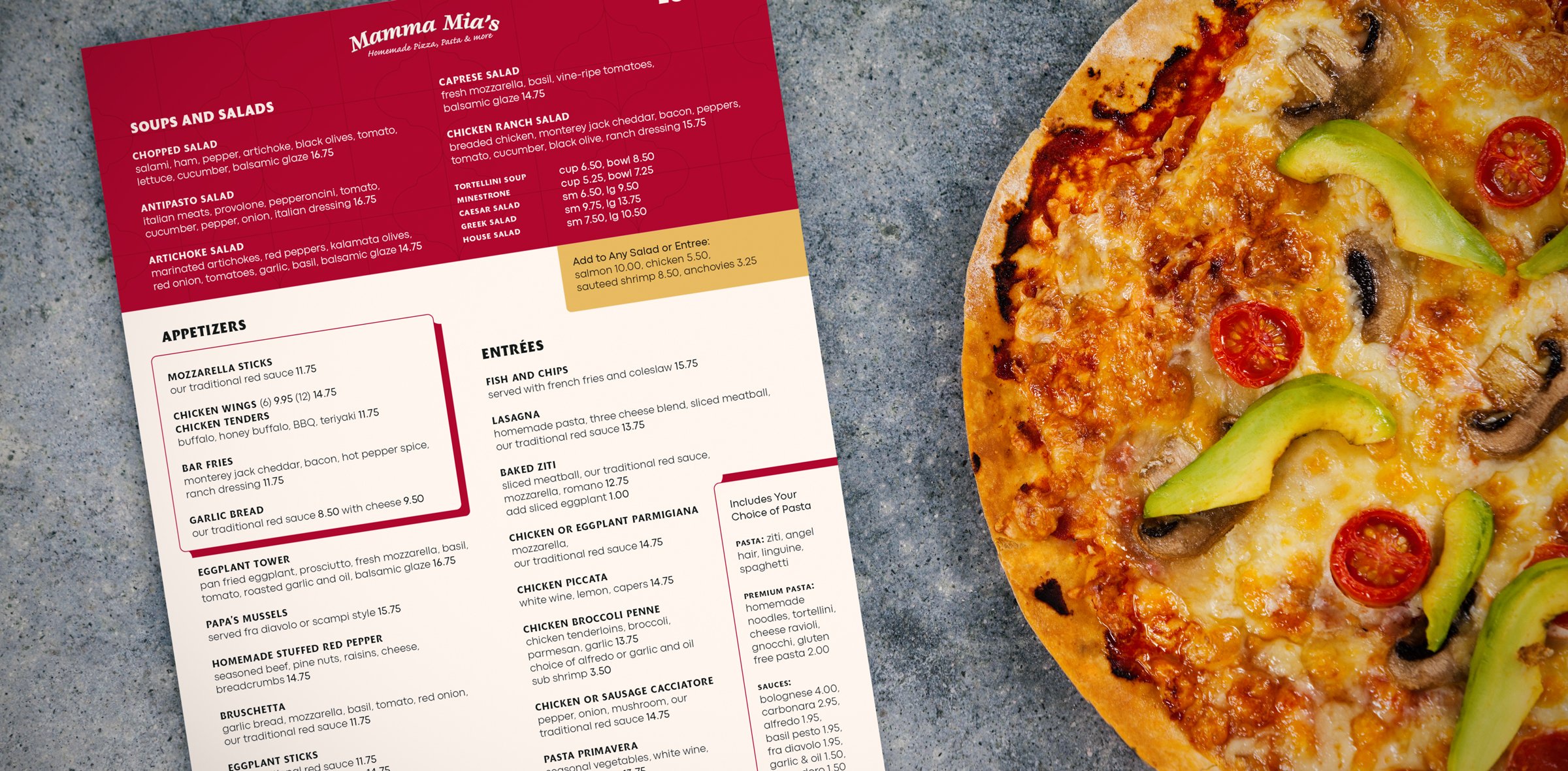
Mamma Mia's, an American-Italian restaurant group with a rich history of serving Massachusetts residents, underwent a comprehensive modernization project in 2022. Their aim was to revitalize their brand and enhance their operations by introducing a contemporary feel, online ordering capabilities, and a streamlined menu across all six of their locations. While embracing these changes, the company wanted to preserve their iconic logo, which is widely recognized in the region.
Our objective was to breathe new life into Mamma Mia’s brand with fresh visuals, impactful messaging, and a beautiful website built for the modern restaurant industry.



Defining Brand Values & Messaging with Leadership Input
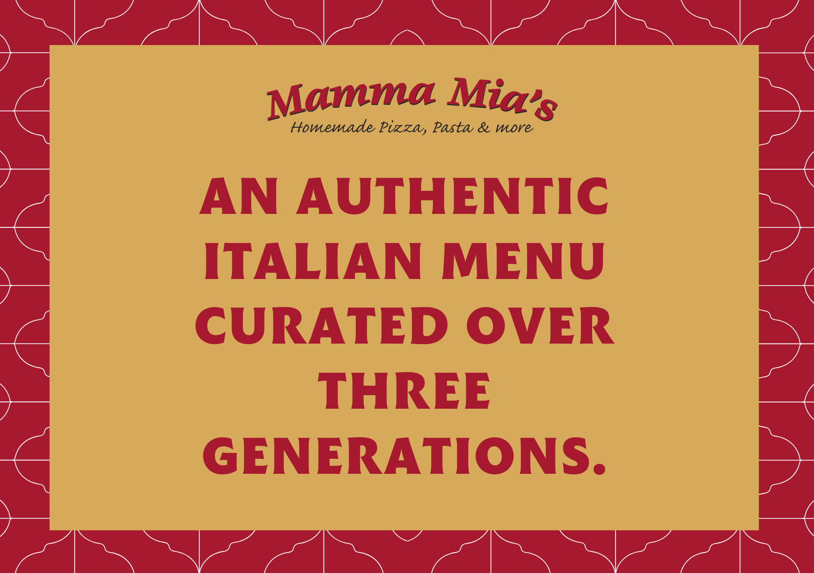
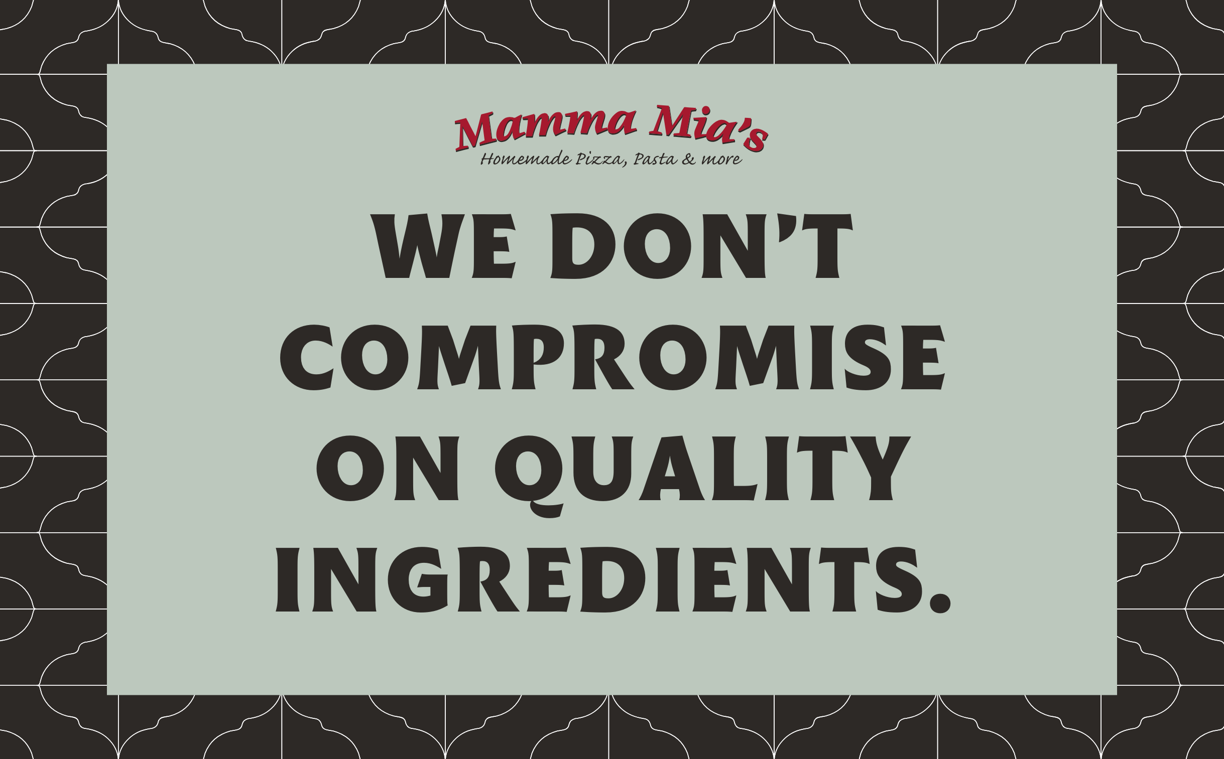
We worked closely with Mamma Mia’s key stakeholders, including Senior Leadership, Marketing, and Restaurant Staff, to gain a clear understanding of the brand's origins. We held two in-person workshops to help us understand their current perspective and vision for the future.
Through brainstorming activities, we identified their core values and developed a captivating brand story that effectively conveyed their mission.
Mixing Old & New to Create a Timeless Identity
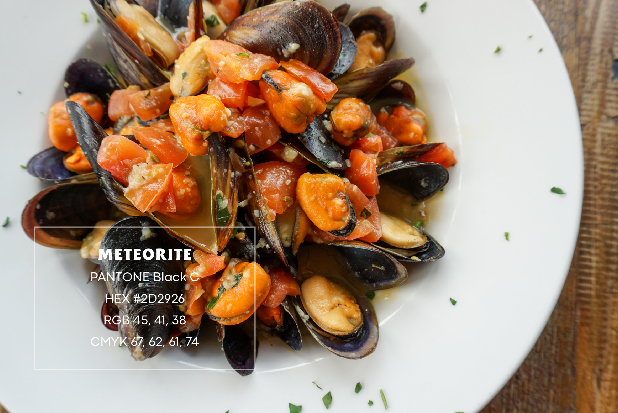
During visits to the newly renovated restaurants, we sourced colors from the interior decor and the most popular dishes on the menu. The resulting brand palette features "Tomato" red, symbolizing Mamma Mia's signature homemade red sauce, and "Meteorite," derived from the black olives in their renowned antipasto salad. The remaining colors were inspired by the interior design of their renovated restaurants.
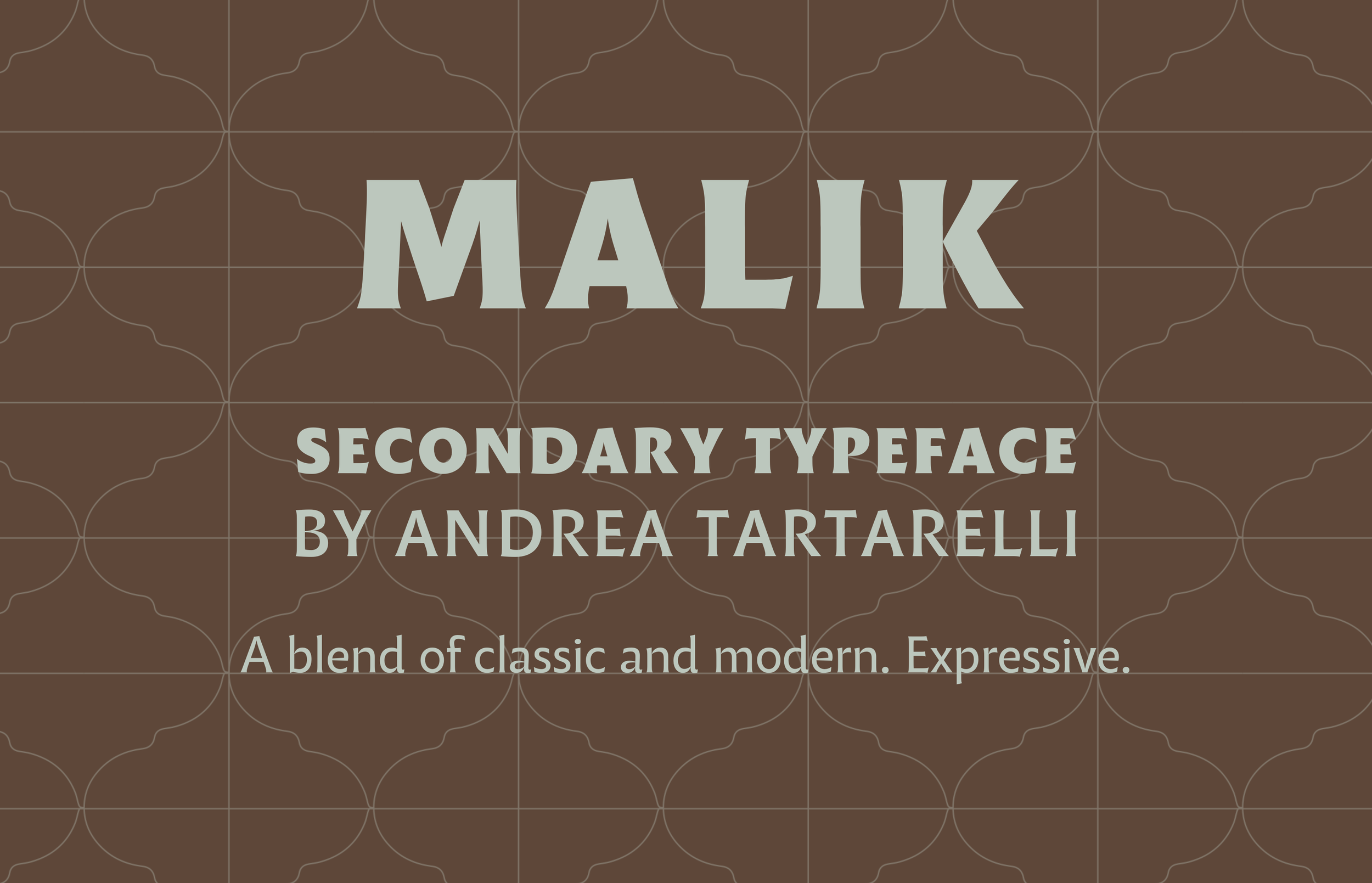
For typography, we handpicked two typefaces designed by Italian designers. Malik, designed by Andrea Tartarelli, seamlessly blends classical letterforms with the legibility of modern sans-serif typefaces. It can be utilized across various contexts, ensuring readability in body text and adding expressive flair to headers and accent typefaces.
Codec Pro, a versatile geometric sans-serif typeface, takes center stage as Mamma Mia's primary typeface. Codec Pro was developed and published by Zetafonts.
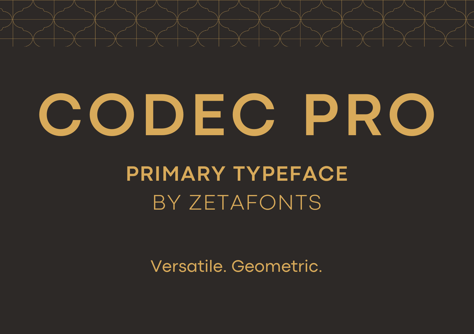


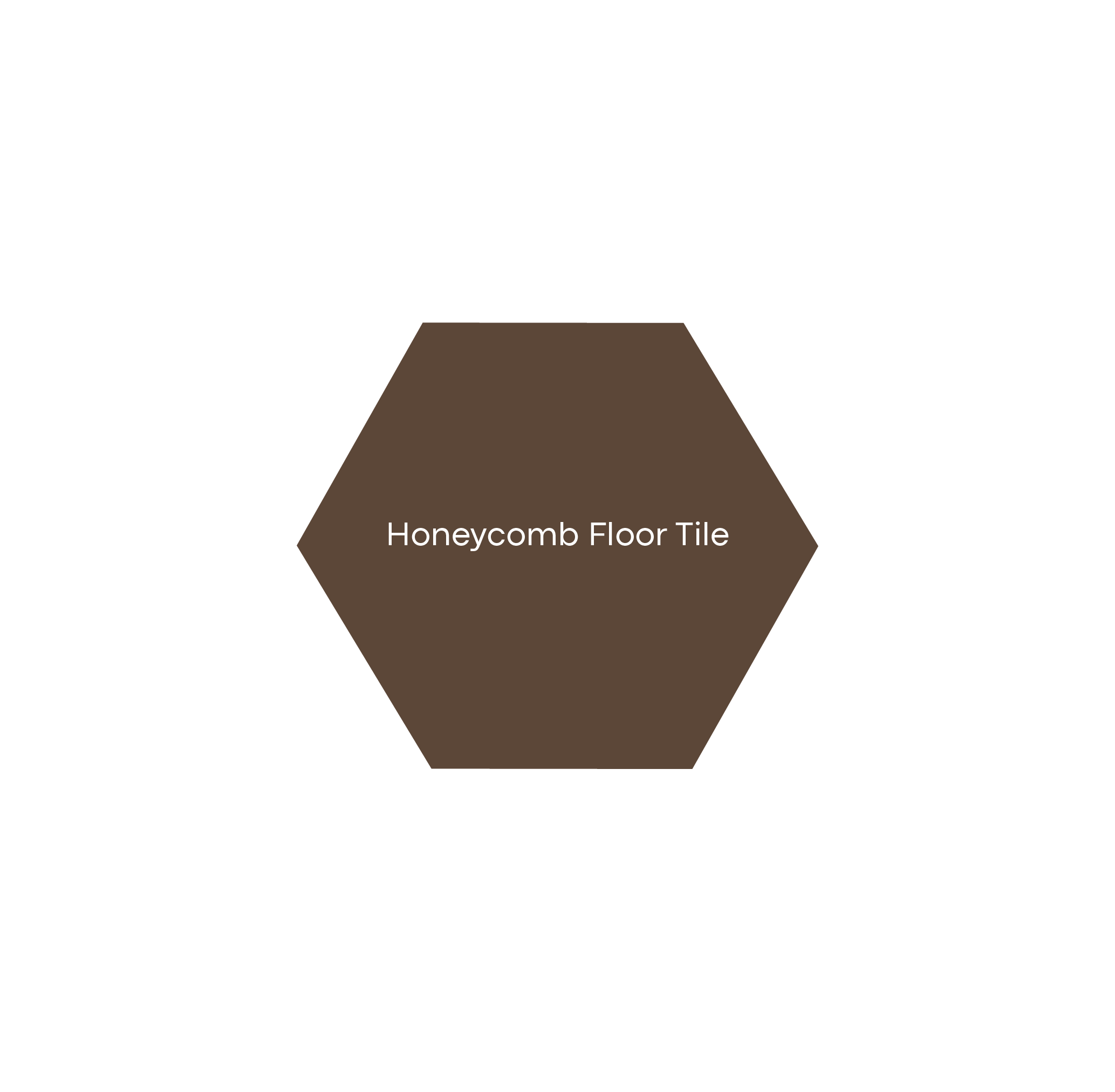
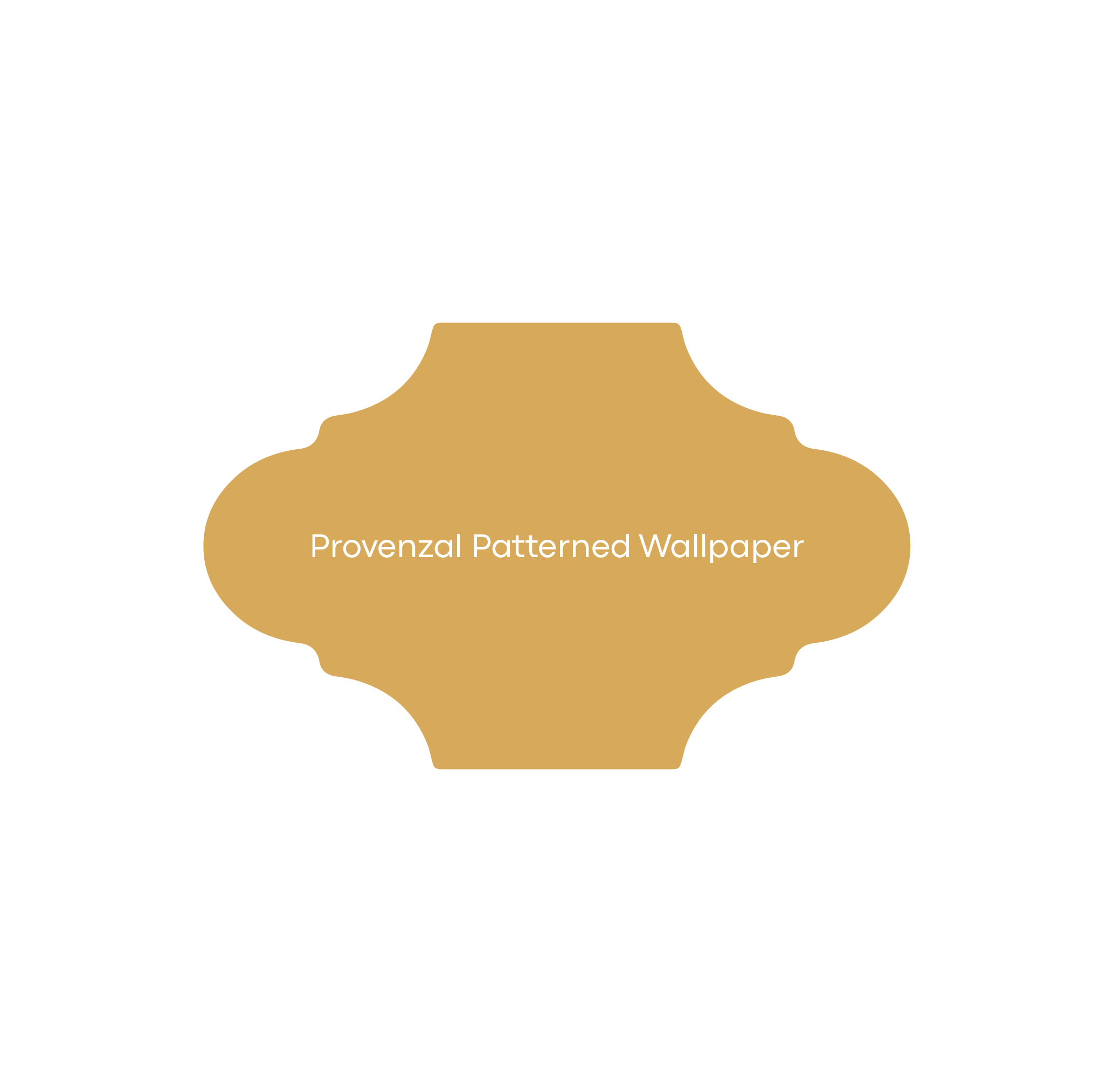
Mamma Mia's brand identity incorporates three unique patterns inspired by tiles found in all the newly renovated restaurants. These patterns serve as powerful storytelling tools, communicating the distinctive atmosphere and narrative of the Mamma Mia's brand, setting it apart from competitors

Streamlining Marketing with Canva: Designing Team-Friendly Templates
To facilitate easy customization by the Marketing Team, we developed a range of design templates for social media, menus, and in-restaurant collateral. Once the templates were approved, we integrated them into Canva, ensuring brand consistency and identity while empowering their in-house team to create visually appealing materials quickly and efficiently.
Website Redesign & Marketing Integration
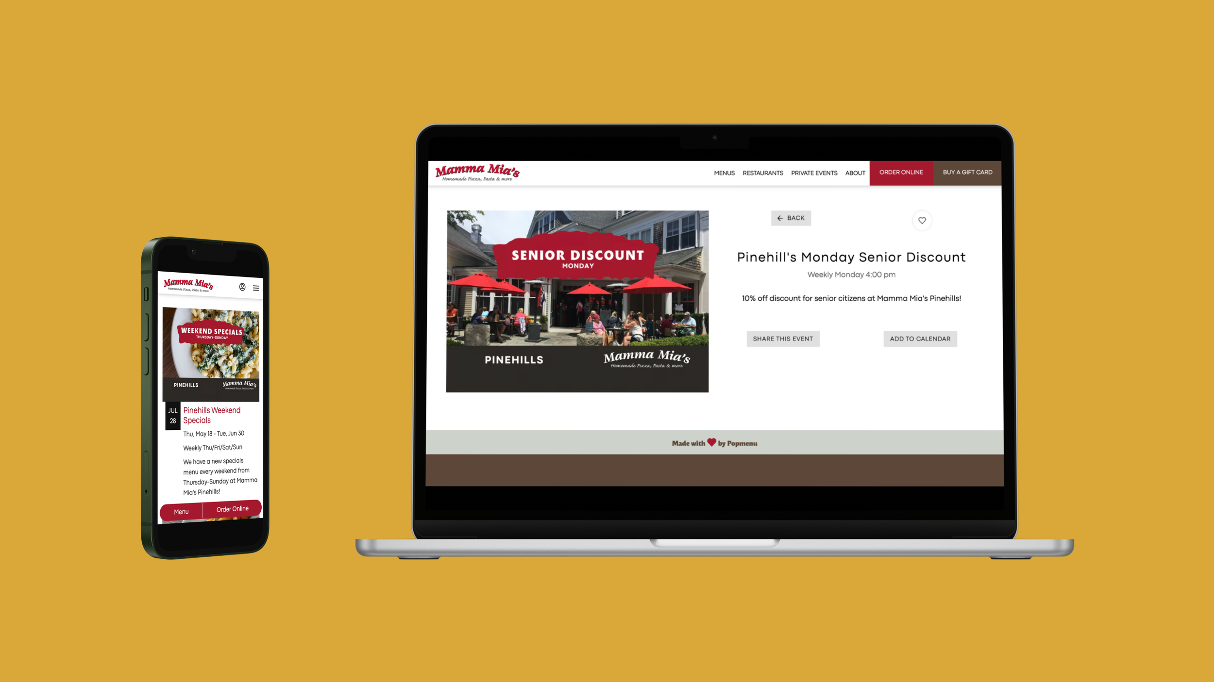
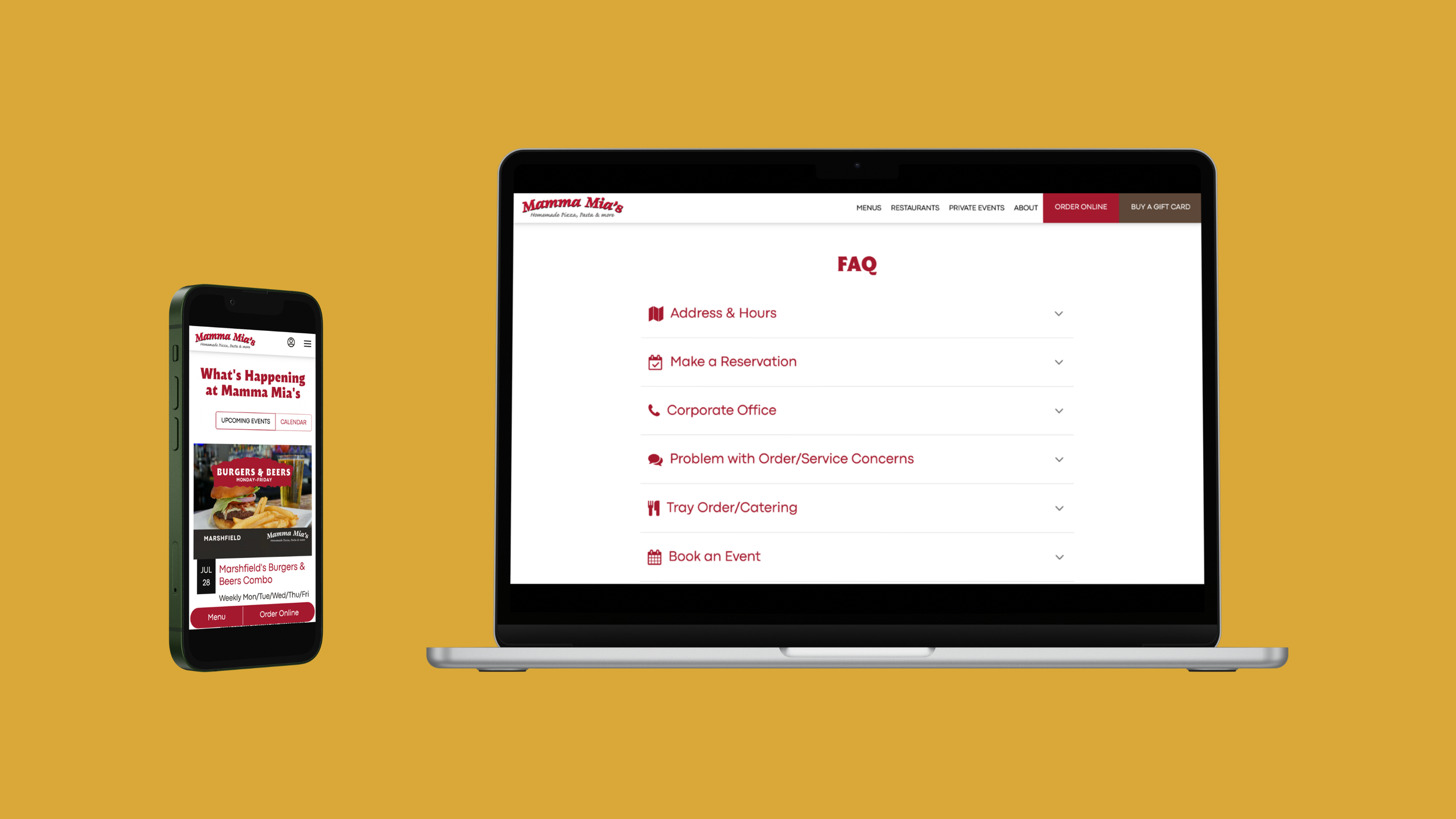
We led the redesign of Mamma Mia's website using the restaurant-friendly platform, Popmenu. This led to a 20% increase in site traffic, totaling 83,000 visits in just 90 days. Additionally, we streamlined marketing efforts by integrating Toast, Constant Contact, and Popmenu contacts into a unified list, with 64% of the 38,596 subscribers now identifiable by location tags—enabling highly targeted, restaurant-specific messaging.


Applying the New Branding to Mamma Mia’s 50th Anniversary Celebration
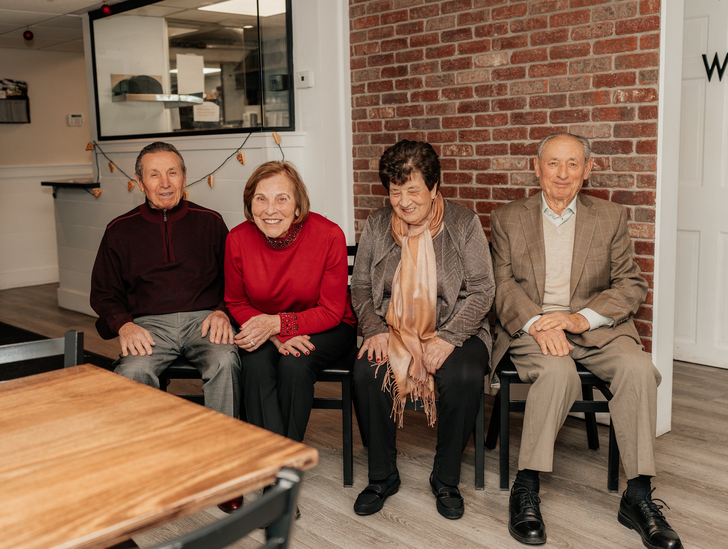
Mamma Mia’s 50th Anniversary was the perfect opportunity for the new branding to shine. As the lead designer and marketing consultant, I played a key role in leading the branding and marketing campaign.
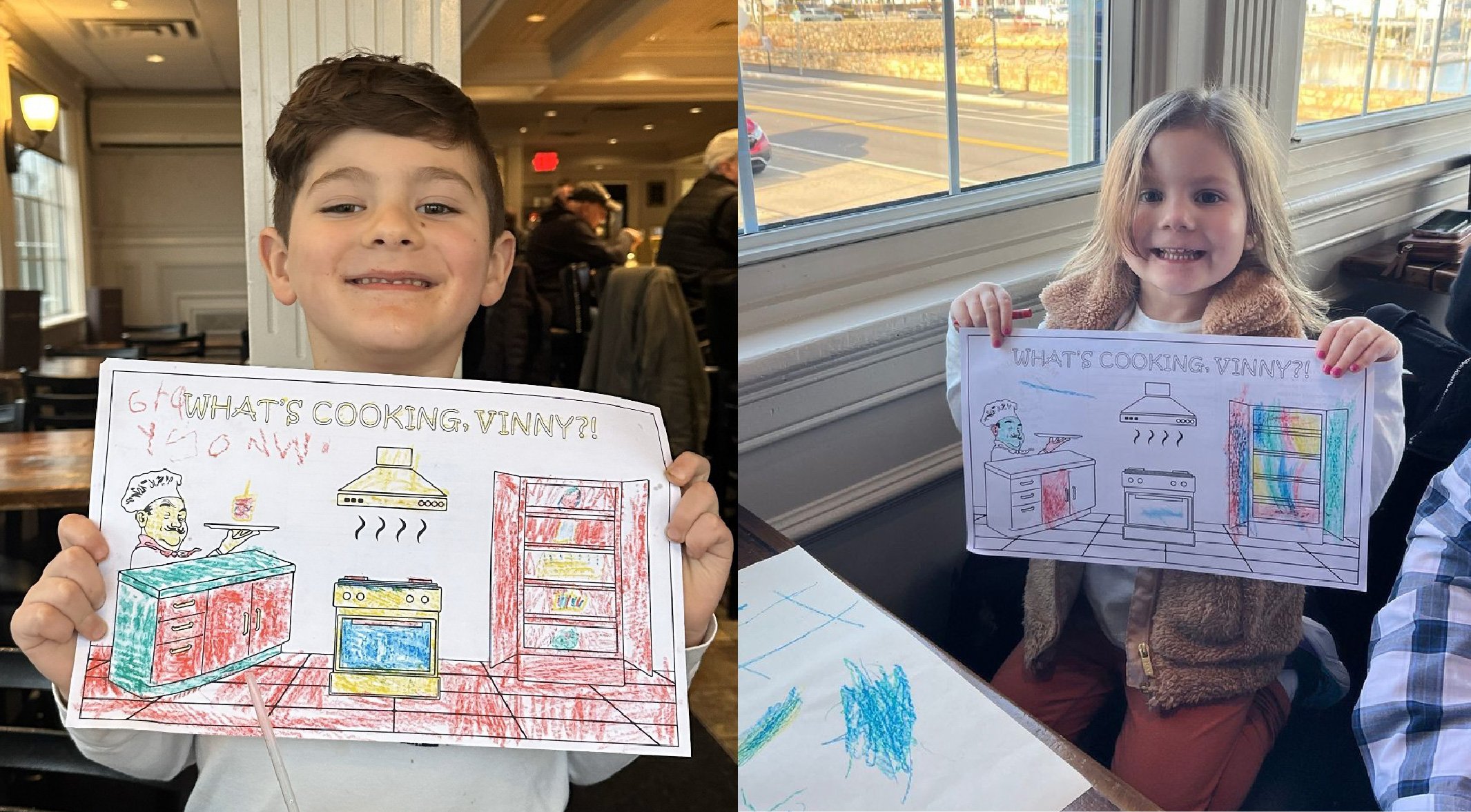
We created a commemorative sub-logo using the Malik typeface, sourced elements from the restaurant’s archives, and updated staff apparel, restaurant collateral, and pizza boxes. We designed an interactive kid’s menu for a 50th Anniversary color contest!
The anniversary celebration at Mamma Mia’s Kingston on January 24th drew nearly 500 guests, increased sales by 86% compared to the previous year (50% of which was from a discount), and garnered 300 new social media followers.



COLLABORATORS
COLLABORATORS
Kelly Nicole Nolan, Lead Designer, Project Manager, Marketing Consultant
Krystyn Wypask, Designer
Payton Liddell, Viscariello Hospitality Group
Philip Tringale, Viscariello Hospitality Group
Big Tree Video, Videography
Allison Varao, Kingston Living Magazine Photographer
Next Project
The Babysitter: My Summers with a Serial Killer
Marketing strategy and brand identity for true crime book release, in partnership with Simon & Schuster

